Personally, I liked the original set up. As long as you are changing ontologies, you might as well commit paradigmatically. I might have instead suggested aesthetic remedies, like maybe a nice blue background.
I think long term success might be more threatened by just how pushy the software bots end up being.
Just to set expectations up front: most of the changes suggested here are going to be on hold for a bit while I get the site fully functional. Sending email works but needs to be adjusted, and post/reply by email is still in progress.
But I love the suggestions, I’m keeping a list of theme/branding changes to make, so please keep them coming and I’ll get to them.
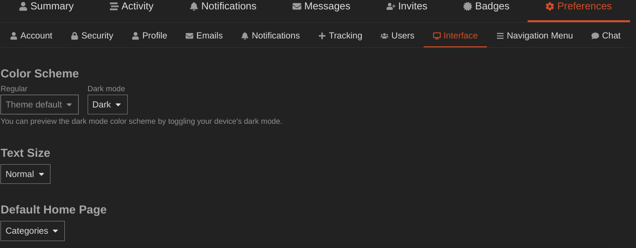
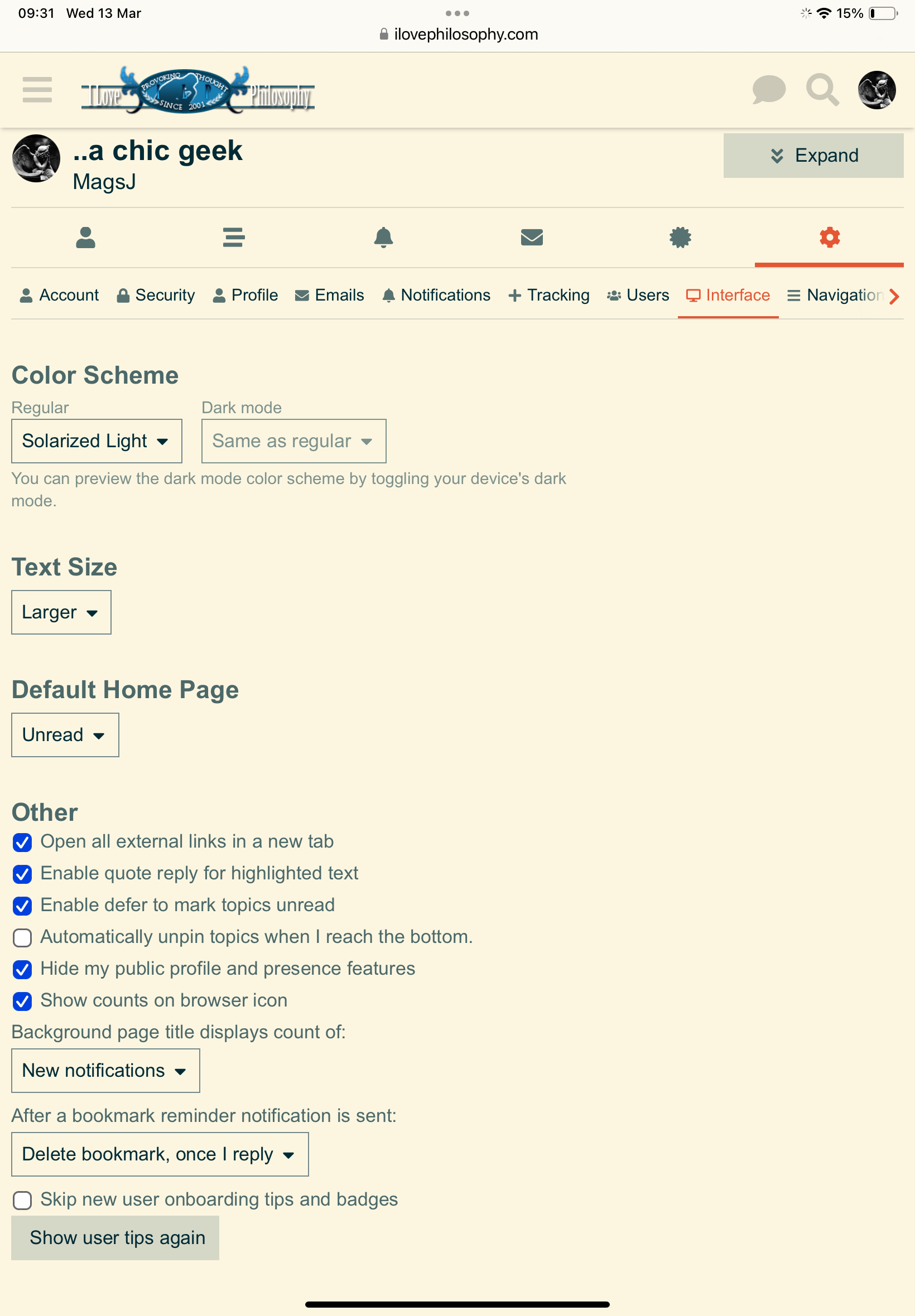
You can set that as your default view: Preferences → Interface → Default Home Page
Agreed, I just cropped the header from the old site; you’re right that it doesn’t work in the new context.
I’m not a graphic designer by any stretch (@Jayson made the logo we had on the old site), but I think I can do simplified – I made the favicon once upon a time, and I’m still happy with it.
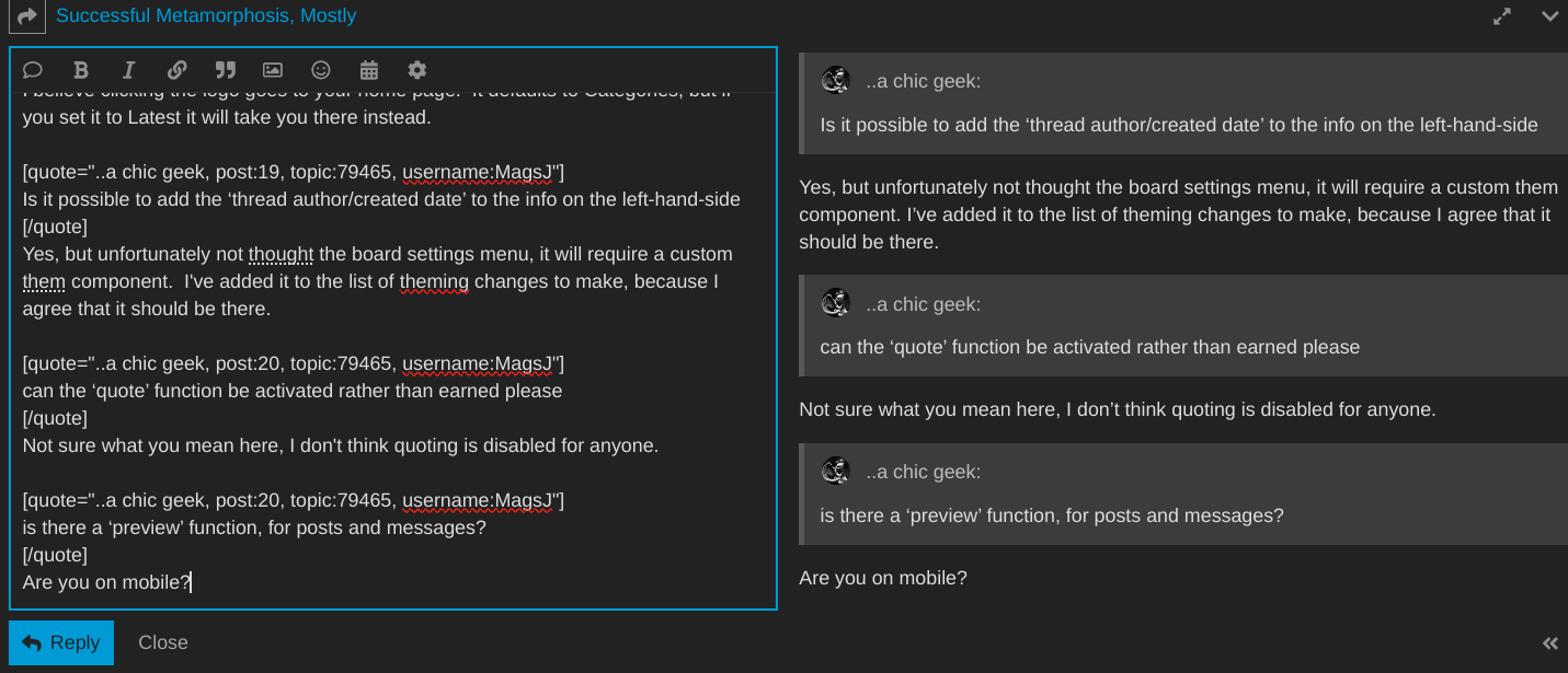
I believe clicking the logo goes to your home page. It defaults to Categories, but if you set it to Latest it will take you there instead.
Yes, but unfortunately not through the settings menu, it will require a custom theme component. But I agree that it should be there; I’ve added it to the list.
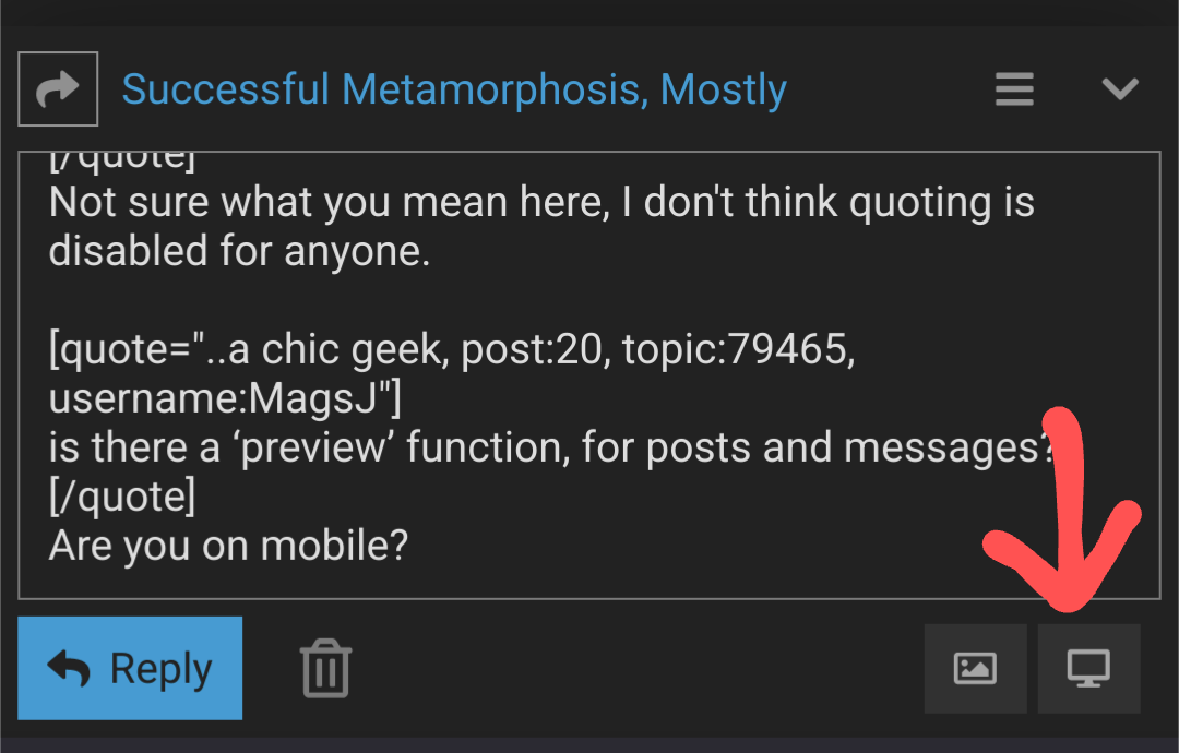
Not sure what you mean here, I don’t think quoting is disabled for anyone. Certain types of quotes are automatically collapsed, but I didn’t think that prevented their use.
Are you on mobile? There’s a little picture of a monitor in the lower right that shows a preview:
I agree we should commit to the new ontology, but I don’t fully understand it yet and trying new things helps. In any case it isn’t urgent, and incrementing toward the ontology as we learn about it is a also a way of committing.
I agree on colors.
What are you referring to here? Anything pushy is configurable, and ideally the software should just get out of the way and let people read/write. Most pushy things can be removed and/or dialed-back in user preferences, and I’m happy to see what can be done on the back-end about anything that can’t.
Sorry, not sure if that can be helped. They should only be local cookies to hold your login credentials, though. When it’s set up, posting by email won’t require them, as long as you’re sending from the email address attached to your account.
When I logged in the first time, I was informed of my standing with the software, and told that it will be keeping an eye on what it likes for proper comportment. Along with the badges system I’ve noticed, and it doing that thing whre it suggests to you things to check out make me think that there is some level of stewardship. That level can be light, which wouldn’t be insupportable, or heavy. I might also be reading too much into it and have nothing to notice about it after a few days. Just a concern that occured to me.
That’s true.
Cookies are the work of the devil. But I’m a realist. It just had to be said.
I’m uncertain about the badge system. I reflexively hate it, but I’ve learned to discount my reflexive curmudgeonliness, so I left it on the default settings.
The pop-up hints should only be on the first pass through the new software.
You can disable them completely via User Preferences → Interface → “Skip new user onboarding tips and badges”
Thanks, all things considered I’m feeling really good about it.
Need dark mode. Please update with dark mode option, thanks.
Also, the current layout is not very visually pleasing. Very stale. Try to arrange things visually more like the old site please.
Edit, I found the dark mode. Nice. Still think you should rework the layout to make it more visually appealing. This new layout is super text-heavy, seems dry and academic compared to the old format.
Ideas: 1) bring back the main nested list for all categories from the old site as the home page, 2) make the site logo larger and centered, 3) use alternating and complimentary colors for topics and headings, 4) make user avatars larger
What about our signatures, do we still get to use those? I had a lot of stuff in my signature but it seems gone now. Or maybe it needs to be enabled in my settings? I’ll check, but please make sure we can still set our own signatures for posts.
Dry and academic is not necessarily a bad thing for a philosophy website, but I take your point. Customized theming should help with that. Decreasing the density of text with a little more space between elements could be nice.
There is live chat. Go to Channels from the menu on the left (or on mobile from the hamburger menu). So far it’s only got Philosophy and Social channels, but I can add more if there’s demand. There’s also a way to create custom sub-channels, but I haven’t played with it.
I don’t think the software supports signatures, and I can’t see going out of my way to reimplement them. I hated signatures. It was like appending an off-topic post to every post.
I will look into other ways to add flair to posts. I know your profile page can be customized with a banner image, and I think that shows up when people mouseover your username. I’ll see what else there is.
That’s unfortunate about not allowing signatures, you may not like them but you should understand they are a big part of the appeal for any users, myself included. It helps you customize yourself, assert your values and your ideas, add emphasis and aesthetics beyond simply a name and an avatar pfp.
I would guess that some of the appeal of ILP over years has been the nice clean aesthetics of the website layout, good visual display plus emphasis on pfp and signatures. Most people like to customize a signature for themselves. If you are getting rid of that you will probably lose a decent amount of the appeal of this place to some users. Maybe you don’t care and want to lose that appeal anyway, turn this place into a more academic and “serious” sort of thing, in which case I say, ok then.
Nice touch with the live chat function, btw. I assume it can allow any number of people to chat at once? What about allowing individual live chats between users who agree to set that up?
You can’t consistently suggest we need a cleaner aesthetics and simultaneously demand we bring back bumper-sticker spam on every goddamned post. Customizing yourself, adding emphasis and aesthetics, I get. But signatures are just a bad way to do that – especially because clean aesthetics are good.
People want their signature at the time they write it, and they never think about it again as it gets spammed over and over and over again on every post on the forum. There is just no piece of text in the world that needs to be posted 2000 times across the site.
The best evidence that you don’t actually want every one of your posts to be concluded with a canned bit of text is that there is nothing preventing you from just signing each of your posts, and you aren’t the least bit tempted to do that.
Sincerely,
Carleas
~~~ Live, Laugh, Love ~~~
Aaliyah – 1979-2001 – “It’s been too long and I’m lost without you”
Yeah, honestly the option to disable signatures on the old site was wonderful for me. So many people have very distracting and obnoxious signatures. I kept them on for years, but I kept them on because I thought I’d be losing something if I didn’t see them.
Sorry to disappear for a week, I came down with something (COVID? Flu?) and have been in a fever dream for several days from which I am just emerging.
I haven’t gone through the backlog, and I’m a week behind where I hoped I’d be. I’ll work through it over the next few days, and I’ll have a lot of time next week to try to make up ground.
Thanks for your patience :dancing-banna-emoji: (which I’m now convinced is important to restore)